Invest in your future with Furaha's Education Loans. We believe in the transformative power of education, and our loans are crafted to make quality education accessible. Whether you're pursuing higher studies, skill development, or specialized training, Furaha is your partner in funding your educational aspirations. With flexible terms and personalized solutions, we pave the way for your educational success.
<span data-metadata=""><span data-buffer="">Empower your energy ambitions with Furaha's Power and Electricity Loans. Whether you're a community looking to electrify your surroundings or a business aiming for sustainable energy solutions, our tailored financing options light the way. We understand the importance of access to reliable power, and our loans are designed to support your journey towards a brighter, more energy-efficient future.
<span data-metadata=""><span data-buffer="">Fuel your entrepreneurial spirit with Furaha's Business Loans. We understand that businesses are the backbone of communities, and our financing options are tailored to support your growth and innovation. Whether you're starting a new venture or expanding an existing one, Furaha provides the financial backing you need. Our business loans are designed to ignite progress, turning your business dreams into reality.
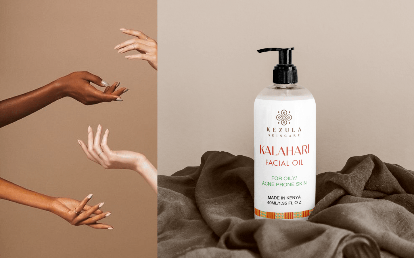
Inspired by timeless traditions, crafted to embrace your African skin!
Client brief
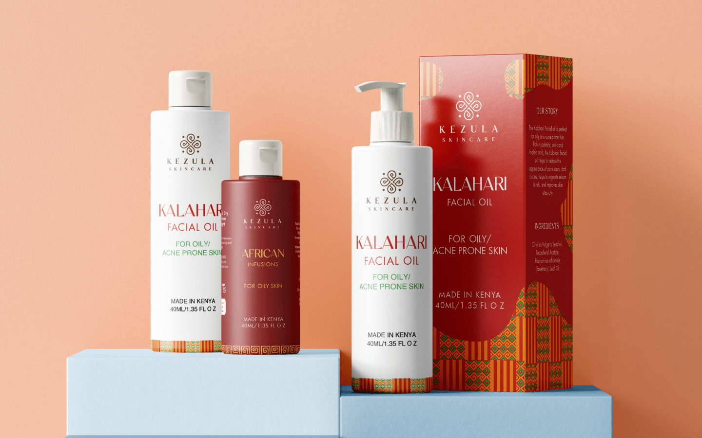
Kezula, a Kenyan-based brand dedicated to producing high-quality and healthy skincare products, approached us to revamp the packaging design for their product. The goal was to create a design that not only felt modern and minimal but also carried deep cultural meaning, reflecting the African spirit and the brand’s heritage.
Our approach
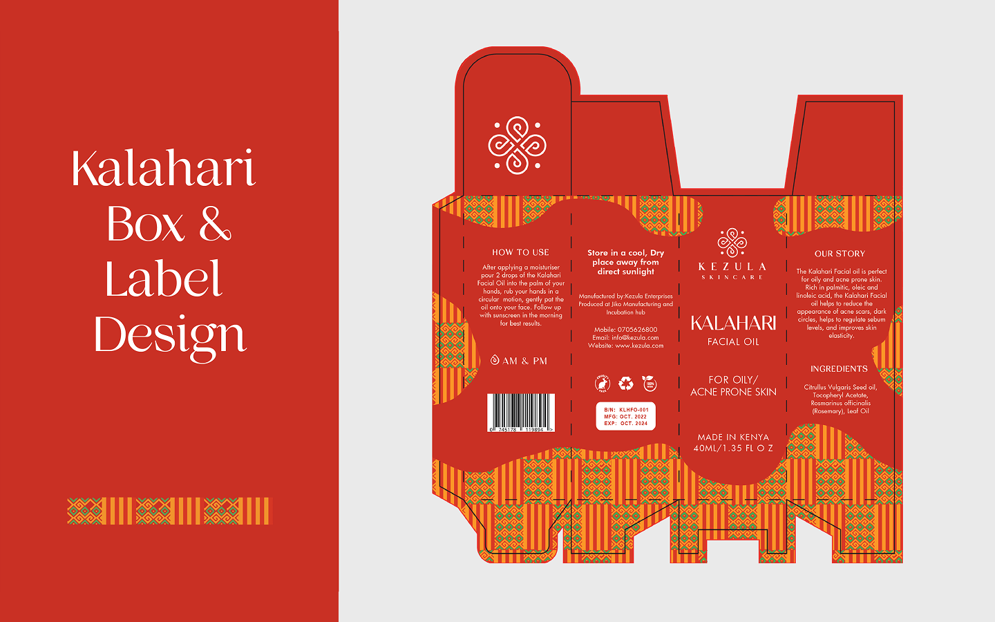
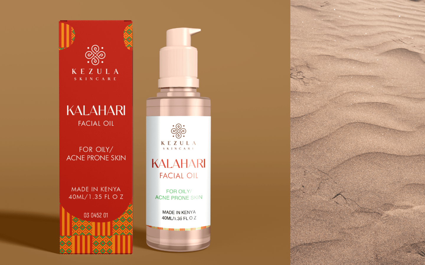
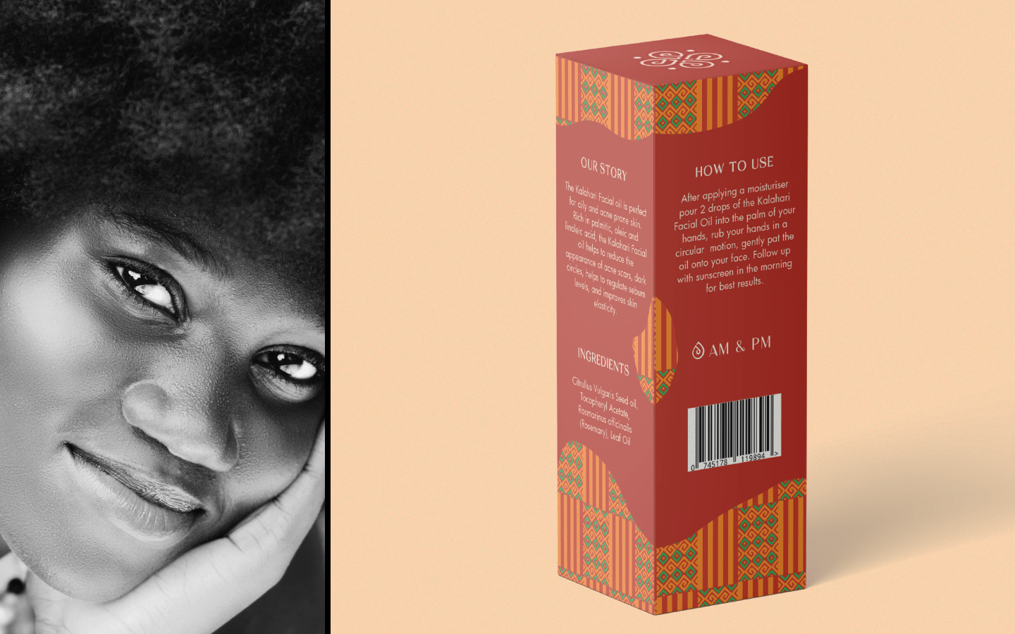
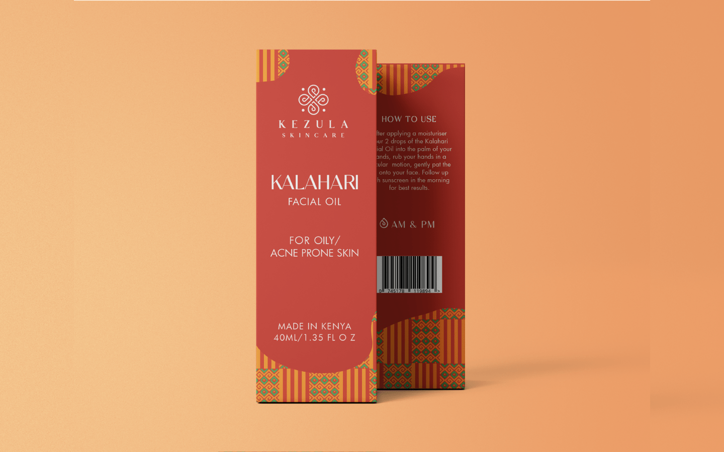
To bring this vision to life, we incorporated a bold African pattern inspired by the Kente garment, symbolizing craftsmanship, identity, and cultural pride. The packaging design also features a rich red hue, inspired by the red ochre used by the Maasai people as a mark of beauty and strength. Additionally, the deep red tones draw from the rich soil of the Kalahari, reinforcing a connection to Africa’s natural landscapes.
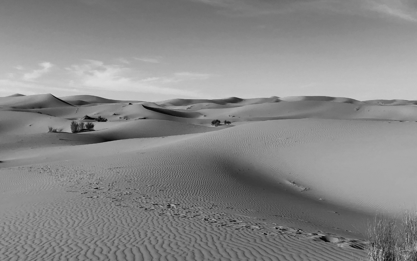
To enhance the storytelling, we introduced organic, flowing shapes inspired by the soft curves of the Kalahari dunes, adding movement and a sense of freedom to the design. The result is a refined yet deeply meaningful packaging revamp—one that seamlessly blends tradition with modernity, ensuring Kezula’s products stand out while honoring their African roots
